In 2007, I found myself in an unexpected position - leading the UX and digital-design work for Governor Mike Huckabee’s presidential campaign. It wasn’t a role I had sought out. In fact, at GSL Solutions where I worked, we had previously decided to steer clear of campaign work after a small project proved to be more demanding than anticipated. But when a friend needed a favor, we decided to help Governor Huckabee with what we thought would be a minor project. Little did we know, this “small favor” would turn into one of the most innovative digital campaigns of its time.
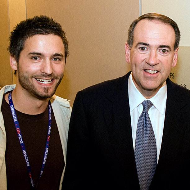


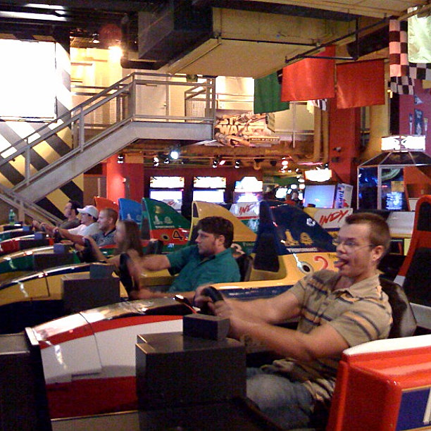
Crammed a lot of life into a short window with these men—notice the Hillary pin? He was the lead developer, and a delegate for Hillary.
The Digital Landscape of 2007-2008: A Web in Transition
Before we dive into the specifics of our campaign strategy, it’s crucial to understand the digital landscape of 2007-2008. This was a pivotal time in web technology, with significant shifts that would reshape how we interact online.
Web 2.0 was just coming into its own. JavaScript libraries were bringing web UIs to life, allowing for more dynamic and interactive experiences. Browsers were beginning to handle increasingly complex tasks, and most sites were now rendered with robust CSS, moving away from table-based layouts.
Social media was gaining serious momentum. YouTube, Facebook, MySpace, Meetup, Eventful, and Flickr were all vying for users’ attention. Twitter was growing at a breakneck pace. This shift towards social platforms was changing how people connected and shared information online, opening new avenues for engagement that we were eager to explore.
On the development front, Agile methodologies were gaining traction, changing how teams approached web projects. While Cold Fusion was still a heavy hitter, Flash was falling out of favor. CSS3 and HTML5 were advancing rapidly, offering new possibilities for design and functionality. Version control was evolving too, with Git on the rise.
Mobile technology was on the cusp of a revolution. The first iPhone had just been released, but its impact hadn’t yet been fully realized. Most mobile development was still catering to Blackberry and Microsoft standards, which were restrictive and incompatible with desktop browsers. This made mobile a challenging frontier that we knew would be important but wasn’t yet central to our strategy.
Compared to today’s web landscape, we faced significant limitations. Screens were generally smaller, forcing more constrained design layouts. There were no real offline capabilities, and bandwidth was still very limited. The lack of sophisticated build tools meant we had to be more creative in our development processes.
Perhaps the most significant difference was in user behavior. Almost all internet activity was still happening on desktops, not mobile devices. The web was transitioning from being primarily a content repository to becoming more application-like. Social media was just beginning to show its potential, and while we sensed it would be significant, none of us truly grasped how transformative it would become.
We weren’t just designing a website; we were navigating a shifting digital landscape, trying to harness new technologies and user behaviors to create something truly innovative in the political sphere.
It’s within this context of rapid change and emerging possibilities that we embarked on our UX journey for the Huckabee campaign. We weren’t just designing a website; we were navigating a shifting digital landscape, trying to harness new technologies and user behaviors to create something truly innovative in the political sphere.
As we explore the strategies and decisions we made, keep in mind that I’m not here to offer political analysis. Instead, I’m sharing my experiences as a UX professional in the trenches, grappling with these technological shifts to create a groundbreaking digital campaign. With this context set, let’s dive into how we approached our primary challenge: making a candidate approachable in this new digital age.
The Challenge: Making a Candidate Approachable
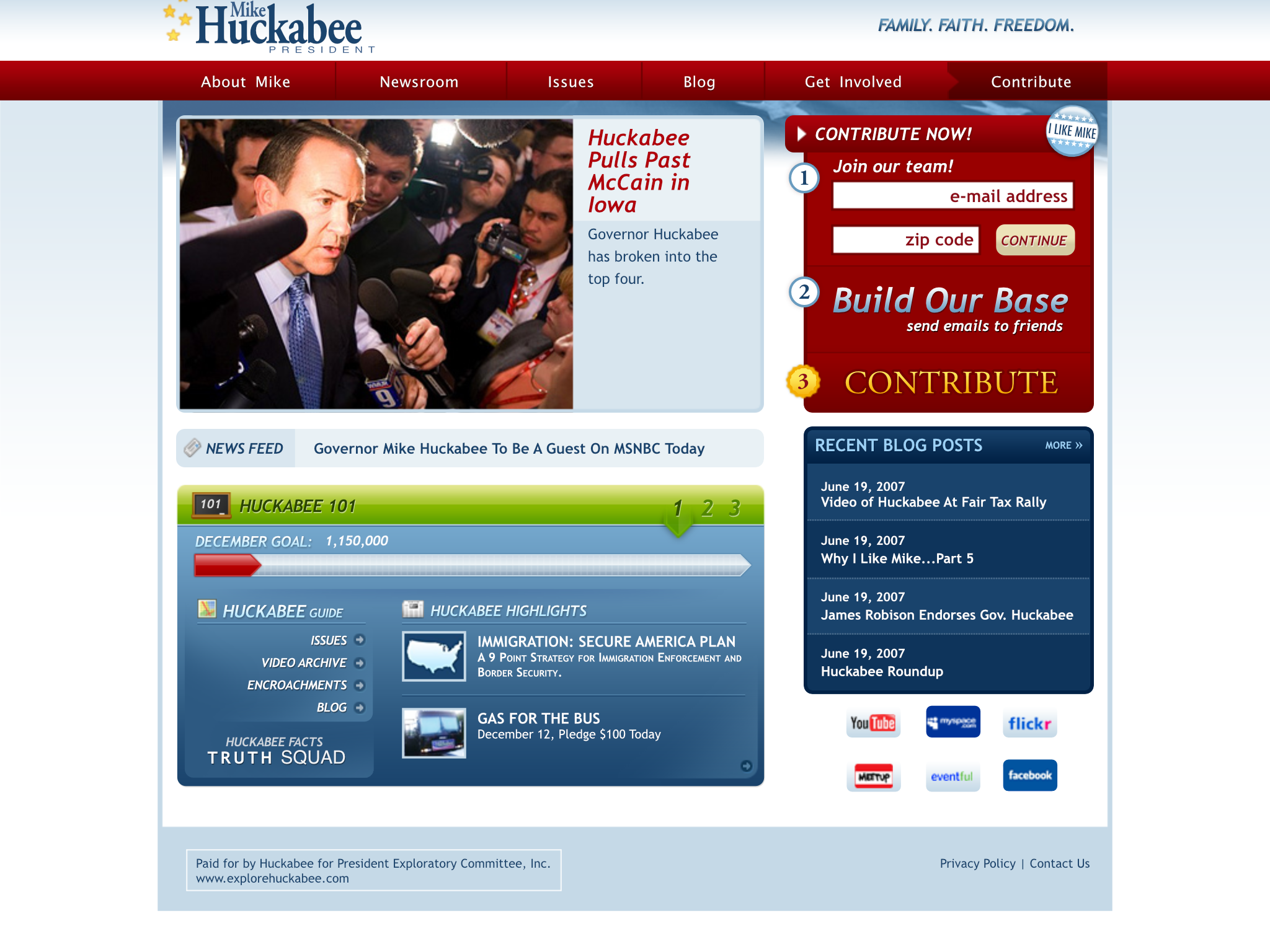
We inherited a make-shift site that didn’t perform well or align to the mounting demands of the campaign. When we took over, our primary objective was deceptively simple: make Huckabee feel approachable. As a relatively unknown candidate at the start, creating an engaging and accessible user experience was crucial. We opted for a blog-like feel, which in 2007/8 was how people typically got to know others online. Web2.0 and Social media were ramping up, and blogs were a popular way to communicate with the growing number of new internet users.
But we didn’t stop at just a blog. We created a digital ecosystem that invited supporters into Huckabee’s world. We hosted a blogroll, allowing other Huckabee supporters to be part of the conversation. We enabled comments on blog posts, organized in-person events for online supporters, and even created a Huckabee “user group” that invited top engagers to provide feedback on the website.
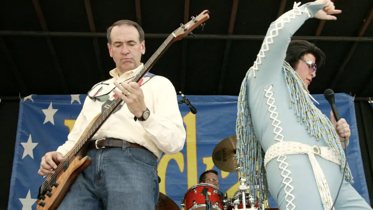
We carefully curated photography that highlighted Huckabee’s personality - whether it was him playing his bass guitar or working closely with his daughter on the campaign trail. We created countless badges that supporters could use on their own websites. Every pixel was designed to connect people with Huckabee on a personal level.
Breaking the Mold: Innovation in Political UX
While most candidates treated their websites as glorified brochures, donation platforms, and email capture tools, we saw an opportunity to do more. We used technology to advance the campaign’s ground game, equipping users to advocate, promote, and gain status as they engaged with the Huckabee campaign.
We were delivering features at a breakneck pace, constantly responding to different campaign initiatives happening on the ground and trying to do so in real time.
We introduced gamification elements that were revolutionary for political campaigns at the time. Engagement leaderboards, point systems, and time-based activities transformed the online experience into something interactive and addictive. We were delivering features at a breakneck pace, constantly responding to different campaign initiatives happening on the ground and trying to do so in real time.
Rapid Development: A New Paradigm
Our development process was as innovative as our features. We had tight feedback loops, working side-by-side through pair programming, pair designing, and developer/designer pairing. This approach allowed us to rapidly develop and iterate on every aspect of the project.
Ideation happened in standing meetings where we’d kick around ideas as a team. When it came to prototyping, I would often sketch an idea on a sheet of paper while sitting next to the developer. He’d provide immediate feedback on technical feasibility, and we’d start fleshing out the rest. This close collaboration allowed us to move at an incredible speed, releasing new features daily.
Overcoming Obstacles: Convincing the Campaign
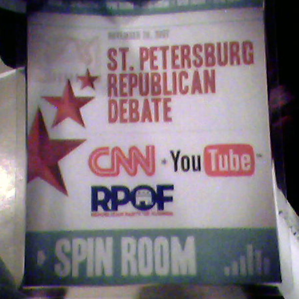
In 2008, there wasn’t a precedent for how to run a campaign online. Technology was advancing rapidly, social media was on the rise, and CNN and YouTube had just hosted the first-ever online debate. We were in uncharted territory.
We always made our case based on expected outcomes, aligning our work with the campaign’s goals.
Our approach was simple: we’d come up with an idea to drive more engagement and donations, work with the campaign team to shape it in response to ground activities, and then implement it, always reporting back on performance. Not every feature was a hit, but most were so wildly successful that the campaign team quickly learned to trust our judgment. We always made our case based on expected outcomes, aligning our work with the campaign’s goals.
Key Takeaways: Lessons for UX Professionals
This experience taught me several crucial lessons that have shaped my approach to UX throughout my career:
Speed has its own value: I learned that you can move faster than you think possible. Sometimes, getting features to market within a certain window is more important than perfection. That window will close, and you can capture some or zero value. Go for more than zero by getting there fast!
Understand your medium: Designers should know the capabilities and constraints of the medium they’re designing for. My understanding of web technologies allowed me to design with feasibility in mind, streamlining our development process.
Close collaboration is key: The tight integration between design and development was crucial to our speed and success. This experience showed me the immense value of breaking down silos between these disciplines.
User feedback is gold: We were constantly looking at data, but the most valuable insights about what to do next came from our trusted user group. These highly engaged users knew how the wind was blowing long before the data showed us anything predictive.
Embrace impermanence: Knowing that all of our work would be discarded after the campaign allowed us to focus on immediate impact rather than long-term maintenance.
In the end, this unexpected journey into political UX taught me that innovation often happens when you’re pushed out of your comfort zone. It showed me the power of rapid iteration, close collaboration, and always keeping the end-user - in this case, the voters - at the heart of every decision. These lessons have stayed with me throughout my career, shaping my approach to UX in ways I never could have anticipated when we first agreed to that “small favor” for Governor Huckabee.
Mini-series
My UX Journey with Huckabee
For years, I've kept these stories close to my chest. Now, I'm ready to share how our small team revolutionized political UX during Mike Huckabee's 2008 presidential run. From breakneck product development to game-changing engagement strategies, this series peels back the curtain on a pivotal moment in digital campaigning. Join me as I recount the triumphs, challenges, and lasting lessons from this extraordinary chapter in my career.